I finally overcame my perfectionism1 and updated the design on here.
I sketched the first few bits for this new design at least a year ago and even started building it during a vacation last February. But after some good progress at first, life got in the way and I never released any of it.
With the end of the year approaching and some days off from work, I thought its finally time to get at it again and set myself a deadline until end of the year to release something. I know much more about FSE Themes now than I did back then, which helped a lot to make progress faster and the fixed deadline helped me to focus and forced me to kick out everything that could delay the release in any way.
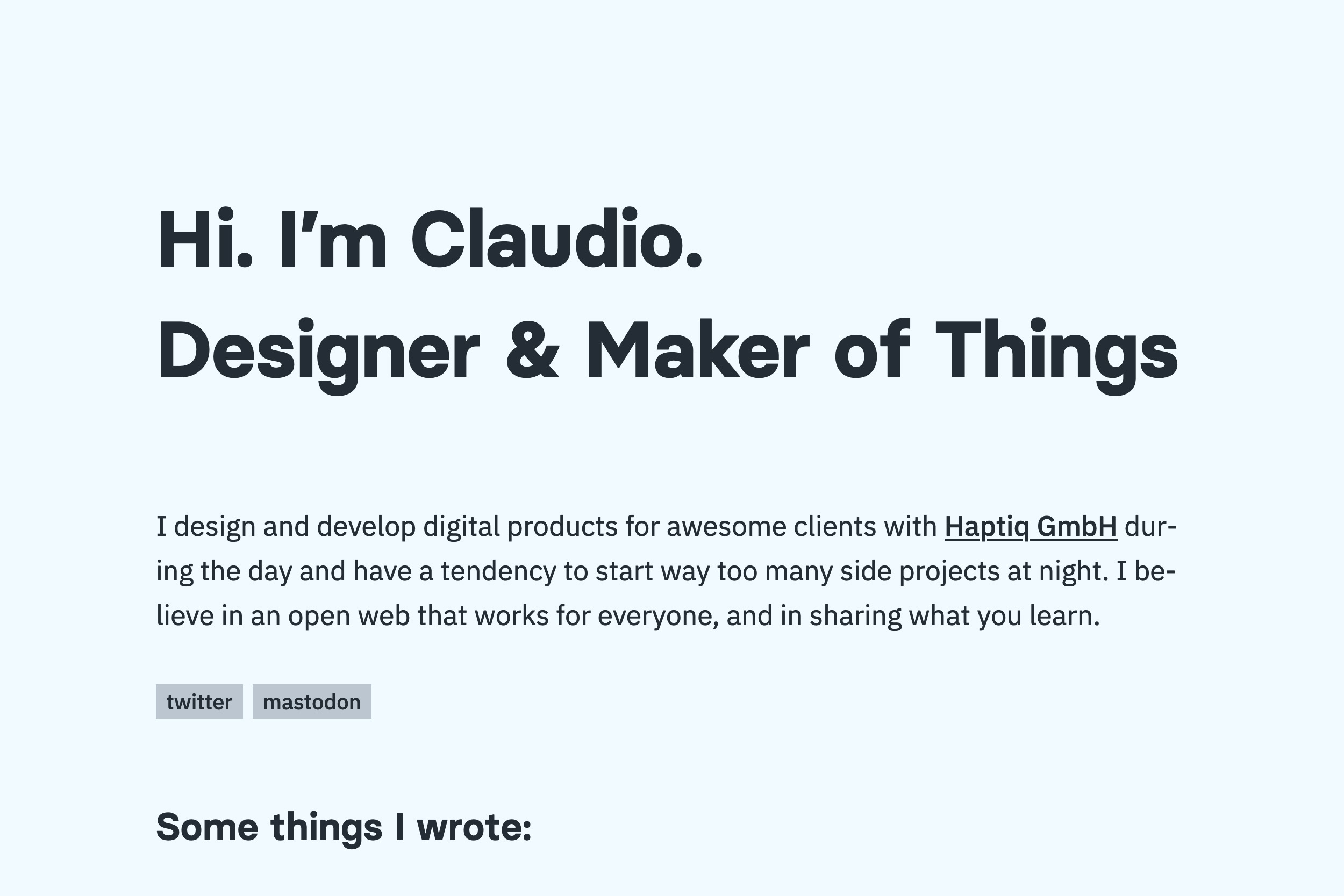
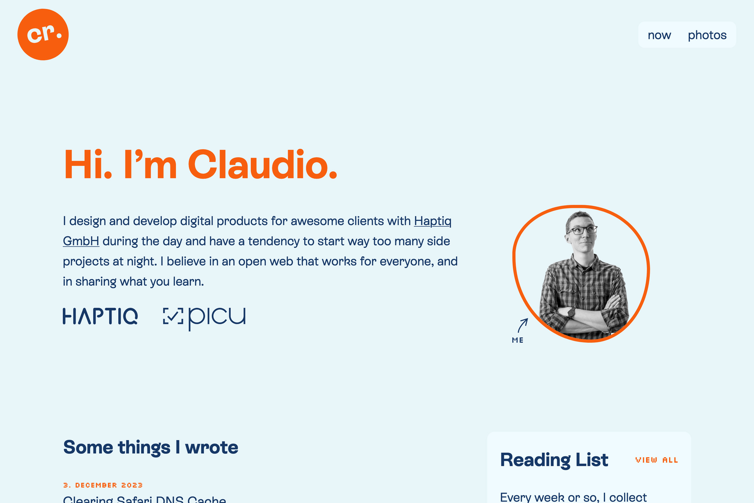
I might go into some more detail about the technical side of things in another article, but for now I’m just happy that I got it out and thought it would be nice to document the process with some before/after screenshots (see below).
Here’s what changed so far:
- New color scheme with brighter colors
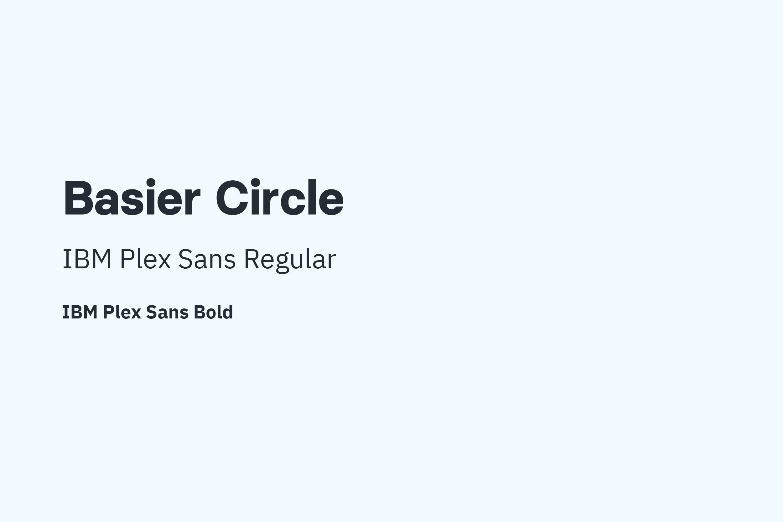
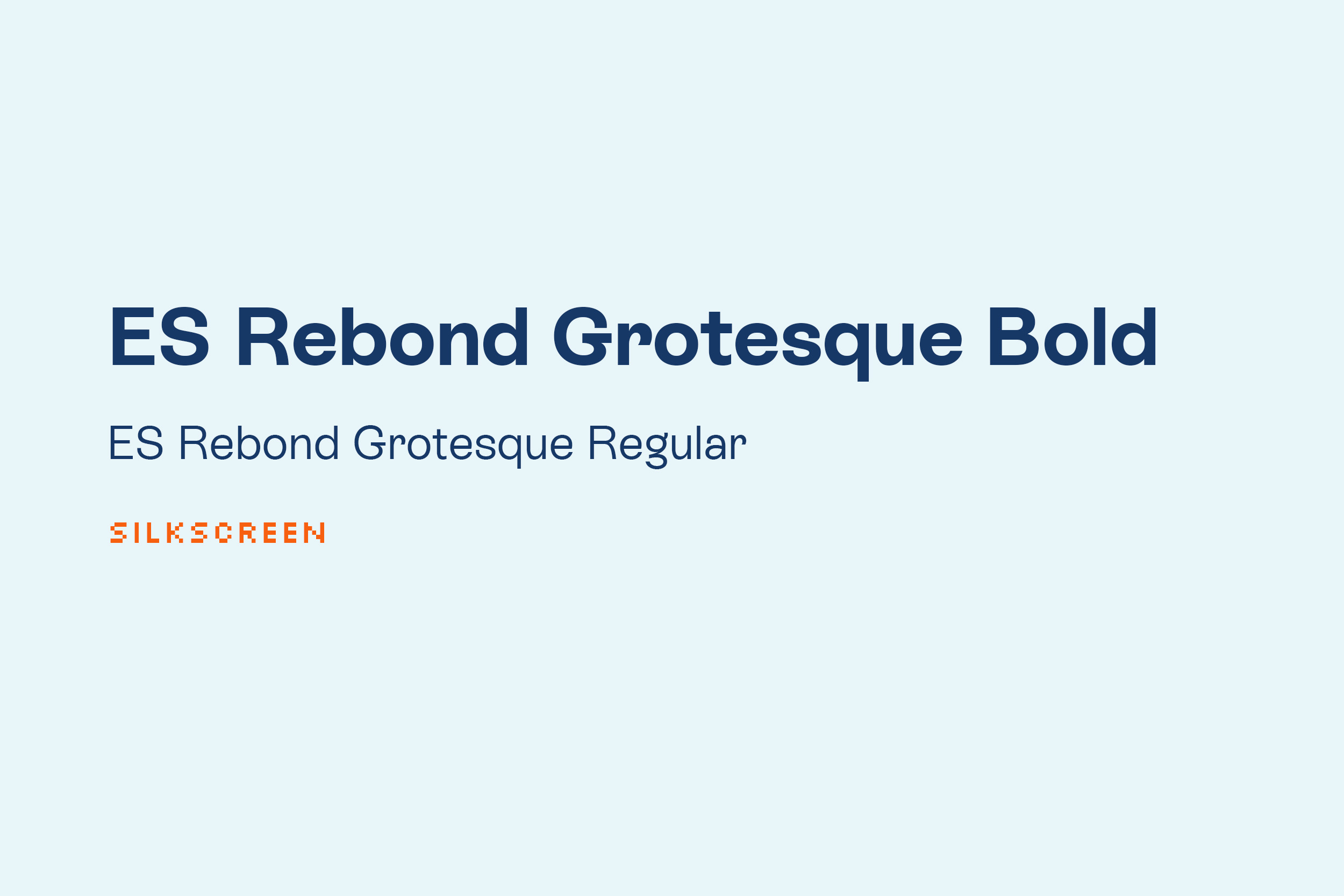
- New typeface
- Brighter, friendlier design with the goal to make it more personal and playful in the future
- Full Site Editing Theme
Reading List
So far, my “Reading List” posts where I collect some links I’ve read along the way, were not really featured anywhere. The only way to discover them was through RSS or if you follow me on Mastodon. I wanted to change that and now they can be found from the Frontpage as well.
“Now” page
I finally added my own now page, which I wanted to do for a very long time. If you don’t know what a now page is, read more about it here.
Navigation
There wasn’t that much different content before, so I never really had the need for a navigation. As I start to add more stuff, and also wanted to play around with the new navigation block for a bit, I added a new sticky navigation on top. Mobile stuff is still a bit wonky, but it works.
Here’s what’s still missing:
- Photos on Frontpage: I wanted to add my photos to the Frontpage as well, but didn’t get it to a point where I’m happy with. Also, I think a lot of what I want to build could be solved with the new partially synced patterns and custom fields that are coming in WP 6.5, so maybe I’ll just wait it out until then.
- Bookshelf: I planned to add some form of a bookshelf with the books I’m reading or have read. Hope to get to this one soon.
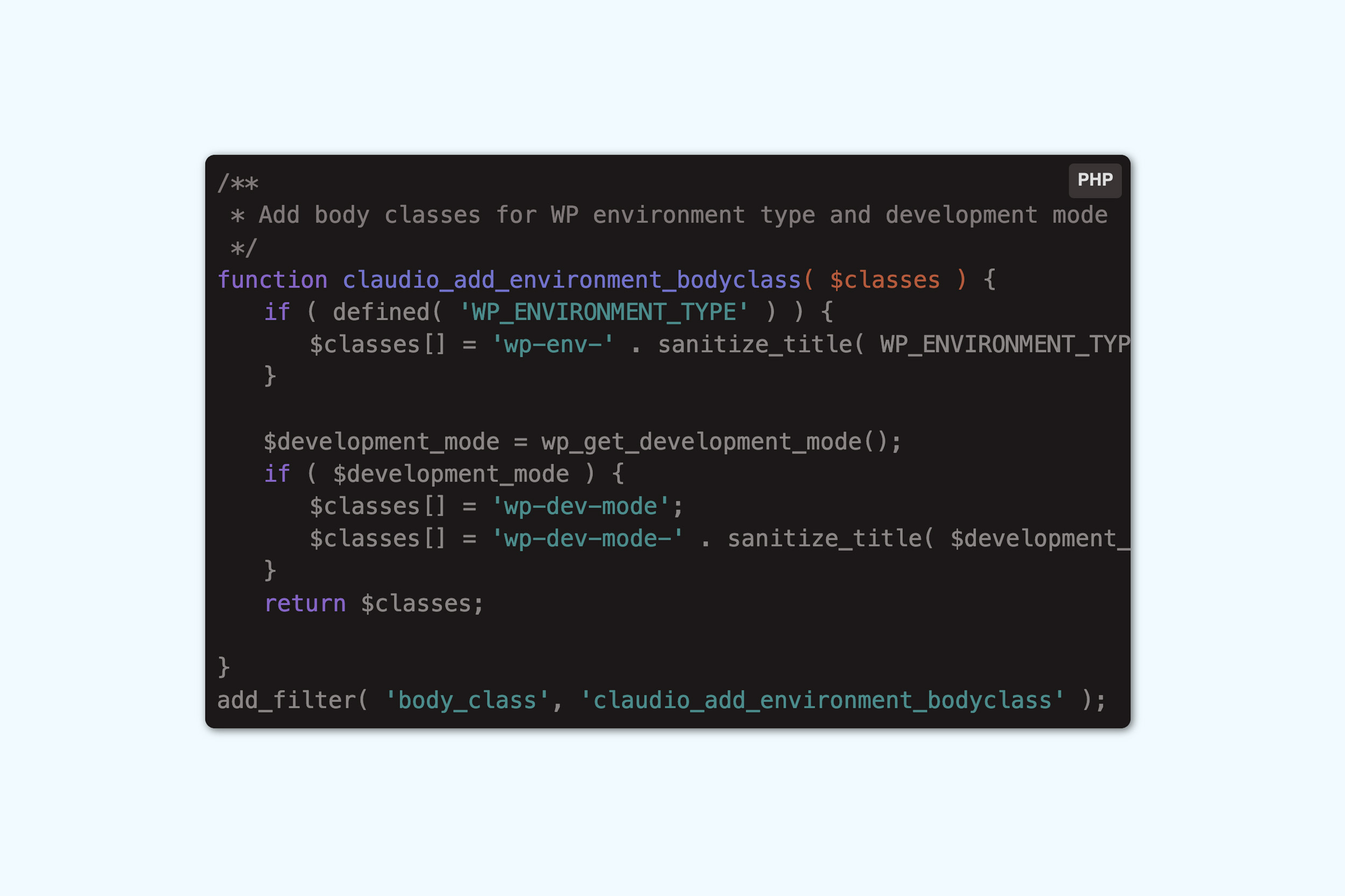
- TIL / Today-I-learned category: I have a category of posts that are not shown anywhere right now, except its own category archives. In there I just post random bits or small code snippets that I learn along the way. I’d like to feature them on the Frontpage or somewhere, but right now this had to wait in favor of not missing the deadline.
- Dark Mode: The whole design is built using variables and I even have all the styles pretty much ready for a dark mode, but I didn’t get around building a switch in time, so this had to wait.
I’m quite happy with the result so far and hope you like it too. The old design always felt a bit too rigid and somewhat boring so my goal was to make the design more friendly, playful and personal, which also fits the tone I try to accomplish with my posts lately.
If you find anything strange or have something else to say about the new design, please get in touch. I’d love to hear your thoughts!
Here’s some before/after screenshots:
- Procrastination, really ↩︎